
The holidays are coming soon and that means you need to be ready to make the most of it, starting with getting your nonprofit website spiffed up, donor friendly, and ready to receive donations.
But, if you’re like most people, you haven’t looked at your website in a while.
That’s a problem.
You see, many donor prospects will check out your nonprofit online before they donate to see who you are, what you do, and how you make a difference.
And current donors and supporters may visit your website for the convenience of making their donation online.
If your website is outdated or the donation process is cumbersome, you will lose people and miss out on donations.
So, now’s the time, before the holiday frenzy begins, to make sure your website is ready so visitors can easily find what they’re looking for on your site, they like what they see, and they click on that “Donate Now” button.
You already know how important it is to have a website these days. The internet is the main source of information for a lot of people.
If you don’t have a website, people think you’re not a real organization.
If your website is outdated or looks homemade, that also leaves people questioning if they can trust you with their money.
So, it’s worth taking the time now to make sure everything is working and in tip top condition before guests arrive at your online door.
You don’t want people leaving away because they can’t find the Donate page or it doesn’t work, especially if you could have spent 30 minutes to fix it.
The holidays are a busy time of year, and you may not love the idea of adding one more thing to your “to do” list.
But the time you spend now optimizing your website is an investment in your year-end fundraising results and you should see a good return on that investment.
At a minimum, you’ll prevent people from bouncing away from your site because it’s too old or clunky.
So, what exactly does an optimized website look like? What should you be looking at to spruce up your site?
Here’s a list of 6 things you can do to get your nonprofit website ready for the holidays.
1. Spiff up your home page. First things first! When a potential donor visits your site, the first few seconds are crucial. Pulling up your website is like meeting your organization for the first time and you want to make a good impression.
Imagine if you went into a bank to open a checking account and the associate was wearing torn up jeans and ratty tennis shoes. Or what if she looked professional but explained the checking account you’re asking about in such a complicated way you had no idea what she was talking about…and it took half an hour! You would probably walk out and look for another bank. You expect representatives of businesses to be warm and professional and to be able to give you important information in ways that you can easily understand.
Your website is no different. Seeing your website is often the first experience someone has with your organization. It’s best to give them an immediate sense of professionalism, warmth, and organization.
The home page or landing page should establish the mission and brand of your nonprofit as quickly as possible. Did you know that people take about fifteen seconds to decide if they want to remain on a web page? Visitors need to be drawn in visually and then find all the information they care about easily and quickly.
Here’s a great example from Hearts Speak:
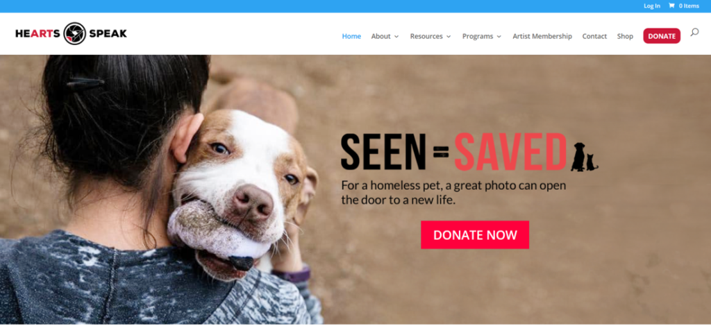
You can see the rest of their home page at www.heartsspeak.org.
Greg Adkins of New Frame Creative says that “crafting a successful landing page is a bit of an art form,” and he offers some tips:
a. Use well-written and concise copy, with no long paragraphs or lists. All content should be in small bite-sized chunks.
b. Use compelling photos and video. Because you have such a small amount of time to grab your reader’s attention, you need to catch their eye immediately. Coupling standout colors and headings with eye-catching graphics is the way to go.
c. Make it easy to navigate, especially to your donation page. Your reader should be able to move from the landing page to anything else they may be interested in easily and without much effort on their part.
d. Make the reader the hero. Questions make good headings like “Do you want to help families in need?” Questions involve readers, drawing them in. Make it clear that it’s the donors and volunteers who make the difference in fulfilling your nonprofit’s mission. The landing page is not the place to talk about your newest board member’s qualifications, awards you’ve won, or how long you’ve been around.
2. Make it easy to donate! You have a donation form on your website, right? Don’t make people hunt for it. Offer a Donate button on each page of your website that links to your donation form with one click. Make it part of the header or main menu so it shows up on every page.
When the donor clicks through to the donation page, a call to action should be prominent like “Your gift helps us feed the homeless!” Make sure your donation process is easy and that it works. Test it on various browsers and on a mobile device, just to make sure.
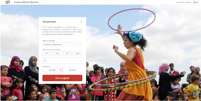
Offer a variety of giving options on your donation page, including different donation amounts and an option to make the donation a recurring one.
The key for this page is that it’s easy to read and that different options aren’t confusing or take much time to figure out.
Here’s a great example of a Donate page from Clowns Without Borders:
3. Optimize the thank-you/receipt experience. Once someone gives, your work is done, right? Nope. There are two parts to the thank-you/receipt process you need buttoned up.
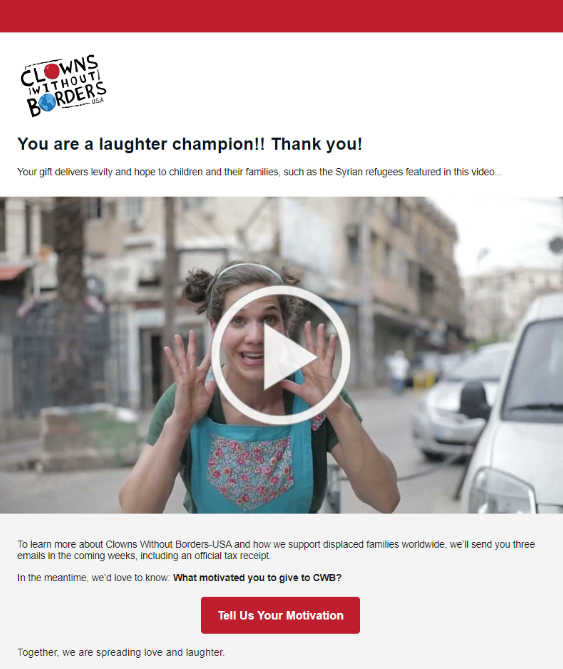
First, take people immediately to a thank-you page after they donate. On that thank-you page, have a bit of text to thank them for their donation and maybe a short thank-you video. Tell them to look for their receipt in their inbox and what to do if it doesn’t show up. Make this page short, easy to read, and include photos if possible so the donor can get an idea of how their money will make a difference.
Here’s an excellent example of a thank-you page from Clowns Without Borders:
Second, make sure the automatically-generated email receipt is warm, sincere, and easy to read. Most online donation tools offer default language for this, but you need to customize it so the language is warm and on brand. And it should be clear that it’s their receipt. For more help, check out this online donation receipt template.
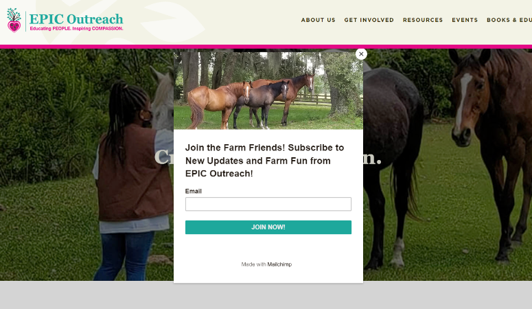
4. Offer an easy opt-in. Like the donation button, the newsletter opt-in box should be present on every page. You can include it in the site’s footer or in a narrow stripe above the footer throughout your website. You can even add a pop-up to capture names and email addresses like Epic Outreach:
If you are using email marketing, your email list is a valuable asset to fundraising and you want as many people as possible on the list.
The newsletter signup should be easy to find, and again, the process for signing up should come up in one click and be simple and easy to complete. Make sure that it is by testing it yourself, asking someone else to test it, testing it in various browsers, and testing it on a mobile device.
Finally, review the thank-you page that someone sees after they opt in to make sure it’s warm and sincere and tells the person what will happen next (“Thanks for signing up! Keep an eye on your inbox for the latest news about our fight to end hunger in our community.”).
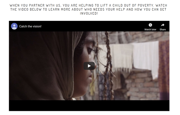
5. Tell a heart-tugging story. Sprinkled throughout your website, visitors should find compelling stories that explain how your organization changes lives. Even if you don’t think you have time or space to tell stories in words, use videos and photos to let your potential donors know the difference their gifts can make. Videos are the most powerful format for storytelling and turning viewers into donors. Video can appeal to multiple senses to engage your viewer, helping them feel the pull to give. Here are some tips for making better videos.
Illuminate India has a fabulous video on their home page:
6. Update your blog. A blog is a great addition to your nonprofit website for frequent updates. The thought of committing to a blog can seem like a lot of work, but there are ways to make it easier. Greg Adkins says, “A blog doesn’t have to be a lengthy, pour-out-your-heart post from the founder every time. It can just be news and notes that you want your supporters to know about.”
Blogs are great for keeping the website up to date and making sure the site feels fresh. However, there’s nothing worse than landing on a website and seeing a blog where the most recent post is three years old. If you’re going to have one, make sure you commit to keeping it fresh.”
So, if you have a blog but haven’t posted in a while, make a point to add 3 or 4 new posts as soon as you can so there’s fresh content for visitors to find during the holidays.
Your nonprofit website is a powerful tool for holiday fundraising and has the potential to expand your organization’s reach, appeal to new donors, engage previous donors, and build relationships.
Take the time to optimize your website using these 6 improvements and you’ll see more opt-ins and donations this year, which means more resources to change more lives. And that’s what we’re here for.
